Case Study: In this new series on Early Bird Strategy, I’ll be exploring real companies and real sites. Whether it’s a full site review or a quick list of things that you can optimize, I hope we can all learn from their mistakes.
One of my favorite things about working in the online space is the ability to make small improvements to things – every day (or almost every day). Especially when it comes to e-commerce, little changes can sometimes yield big results, but more often than not, you’re seeing little gains that over time add up to a big deal.
Icebreaker is an outdoor clothing company from New Zealand. They specialize in merino wool and you can even trace the origins of your Icebreaker items to specific sheep stations in New Zealand via your baa-code. Adorable? Yes. Now here are 13 things Icebreaker could do to optimize their ecommerce site:
1. Title your products for prospective customers.
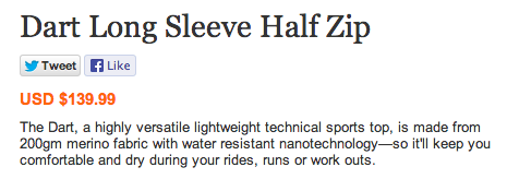
If I’m browsing on Icebreaker’s site, seeing a product titled “Dart Long Sleeve Half Zip” might make sense to me. I’ll assume it’s a top of some kind. However, if I’m searching on Google, I would probably type something like “Icebreaker half zip jacket”. Now, guess what websites are going to show up first? Definitely not Icebreaker. If you don’t want to include your branded name in the actual product title, at least include it in the Title Tags.
Current Product Title/Tags: Dart Long Sleeve Half Zip
Changed Product Title: Women’s Dart Long Sleeve Half Zip Jacket Title Tag: Women’s Dart Long Sleeve Half Zip Jacket | Icebreaker
Making changes like this will help your product to display higher in search results, organically. While sometimes branded companies need to watch out for competing too heavily with their wholesale customers (in Icebreaker’s case REI, Moosejaw etc), I would say organic search is not one of those times.
2. Add upsell times to the shopping cart to incentivize last-minute (usually lower priced) add-ons.
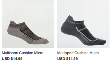 If I add something to my shopping cart, you can assume I’m at least more interested than someone who left the site, yes? Why not show me something cheaper that I would be more inclined to add on, like these $14.99 socks (I’m assuming they’re socks from the picture, although the product title is simply: “Multisport Cushion Micro”. see #1 above). Will every customer do this? No. Will some? Yes. Is it worth testing to see if it lowers conversion because it’s distracting? Yes.
3. Post more frequently on the Icebreaker blog.
From the looks of it, Icebreaker has only posted two times this year. While blogging is sometimes thought of as just marketing’s roll. The e-commerce team should be pushing to have their new/seasonal products highlighted on the blog and social media. When customers follow and interact on social media, they’re essentially saying “I like you, I want to hear from you”, so while there’s a fine line of posting too much product info versus “general outdoorsy, fun etc.”, Icebreaker has some space to feature more than just a few giveaways.
4. Make the splash images on the homepage clickable, not just text.
Most shoppers are used to clicking on images, not just text. Maybe Icebreaker has tested this already and found otherwise, but I’m guessing they haven’t (given some of the other low-hanging fruit they have out there). What if I really like this hat now that I see this outfit assembled and want to click on it? Now I have to scroll through and look for it.
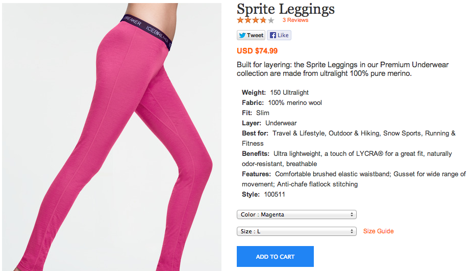
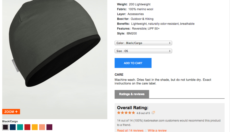
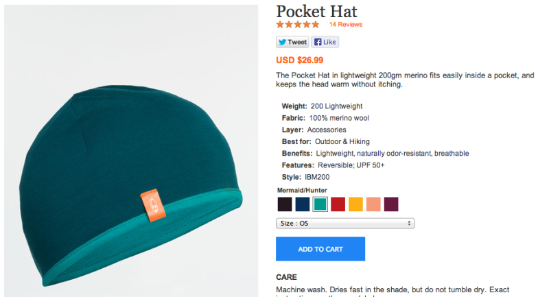
5. Simplify color and size options whenever possible.
Actual site
proposed changes
When you first arrive to a product page, the color options are below the fold beneath the product image. There is also a dropdown that lists color options, above the size dropdown, but if these two areas that communicate color were combined (like my mockup image on the right), it would simplify the process. Most shoppers are very visual when it comes to colors. If I see seven colored squares, I don’t need to read a dropdown list and “understand” it, because I already see what colors are offered. Amazon does a great job of this. Fewer options for a user to think about is one step closer to the cart.
6. If you’re going to have social share buttons on product pages, make it easy for me mention your brand!
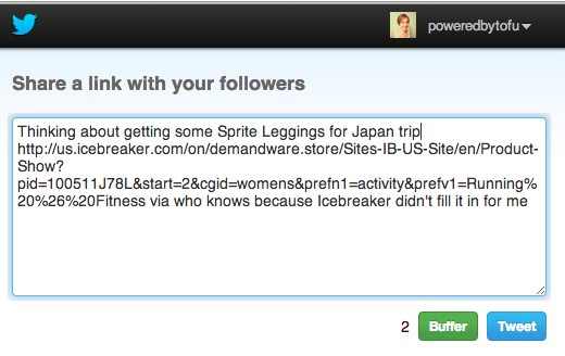
Icebreaker does have Twitter and Facebook social share buttons on their product pages, that’s a start. However, the Tweet button doesn’t specify a “via” Twitter account so you can better monitor and acknowledge shoppers, and also so their Twitter followers know that they’re talking about you. A tweet should look like “via @Icebreakernz” on the end. This is especially important since Icebreaker doesn’t have the @Icebreaker twitter account, as many Twitter users assume, but are instead @IcebreakerNZ.
7. Is the “Quantity” button missing for a reason?
Icebreaker may be using their internal sales knowledge that says people never buy more than one item of the same thing and therefore they don’t include a quantity button on product pages. Either way, they should test it, if they haven’t already.
8. Increase the font size slightly for readability of copy.
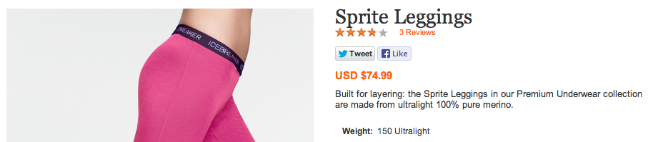
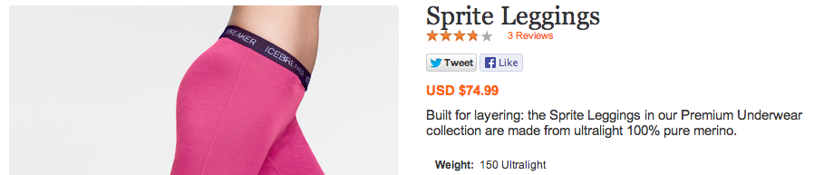
Is there a way to increase the font size and break up the product description copy so it’s more readable or part copy and part list? The first image above is the original, and the second image is with the font bumped up slightly.
9. Make the “Size guide” link more visible.
The size guide to the right of the “Add to Cart” button, might be more useful if it was an underlined link, and/or had an icon to make it more visual.
10. Consider using live chat.
While live chat doesn’t work for all ecommerce sites, it can help turn unsure customers into confident purchasers. Many of Icebreakers wholesale customers use live chat as well.
11. Consider allowing images in customer reviews.
While customer-provided images aren’t right for all products and industries, Icebreaker is in a unique outdoor/travel niche, that could benefit from customer images. Users might also feel more connected and excited to share their “product in action”. Urban Outfitters is a great example of this feature already in practice elsewhere.
12. Would Facebook comments be appropriate on product pages?
It might also be interesting to test out Facebook comments on product detail pages. It could also be in an expandable/collapsible area so that if a shopper collapsed it, they wouldn’t keep seeing it. Not everyone wants to leave a review, and it could be a way to increase social traffic. This would be to engage with pre and post-sale shoppers, where a review is just post-sale.
13. Make Facebook, G+, Twitter, and newsletter signup more obvious from product pages.
I have to scroll all the way to the footer to see Icebreaker’s social media links and newsletter signup box. While the main goal is probably sales and information for these pages, by making it easier for shopper to engage with Icebreaker when they’re “further up the funnel” (ie. just browsing, learning, exploring) this would give Icebreaker a chance to reconnect with potential customers beyond ad retargetting or if people got to the step of creating an account.
In closing, Icebreaker could learn a few things from built-for-conversion Amazon. They’re always a good rule of thumb, but for more outdoor specific, although a retailer, Backcountry.com does a great job on their product detail pages. For other branded sites, Lululemon and Patagonia do a nice job on some features as well (like the ‘check online partners’ link etc.)