One of the struggles I hear repeatedly from fellow consultants, startups, and solopreneurs is that they don’t have a logo or consistent branding and are struggling with whether to invest in branding now or wait.
My recommendation is to get started with a typographic logo. When you create a basic branding and style guide for yourself, you can start taking yourself a bit more seriously and actually move forward with your business – doing that thing that is what you do best. It helps to have at least a basic logo and style guide (think color palette and fonts) as you begin setting up your online presence.
When you’re not a graphic designer, this can leave you feeling like the only alternative is to pay someone to create for you. Even if you do outsource the design, remember that it’s still going to be a time commitment of project managing, giving feedback, and answering initial branding questions about your likes and dislikes, mood boards etc. Yes, you could spend months and thousands of dollars on a logo and branding project, but our main focus today, is to Start! We want to get our business out there and then iterate.
Graphic designers are an amazing bunch of people, and some of them deserve your business and money. However, if you DIY for the first few months to year, before hiring a professional, you’re going to have a much better idea of your likes and dislikes, what serves you well and is lacking in your current branding, and how much it’s worth to you.
How to Pull Together a Style Guide & DIY Logo
Table of Contents:
1. Get everything ready
2. Create your brand identity
3. Identify 3-5 style likes and dislikes
4. Identify the range of styles in your industry
5. Create a mood board
6. Pick a color palette
7. Identify your two core fonts
8. Gather your tools and decide on resources
9. Begin creating
1. Get Ready: Embrace the fact that this isn’t a $5,000 branding project
The goal of creating a branding style guide is to have a passable logo, to get your website launched, to get your web presence started etc. Whether you keep this “logo” and style guide for 3 months or 3 years, the point is to have something to not be conspicuous in its absence. Meaning we’re not looking to win any design awards, we’re looking to have something that is good enough that doesn’t detract from what we’re trying to accomplish with our business. There’s no shame in that!
Action Item #1: Set aside an hour to begin working on this project and see how far you get. Create a Google Doc – ‘My Branding & Style Guide’ and continue to the next step.
2. Create your Brand Identity
Think about the message you’re trying to convey to your audience and prospective customers. A simple Brand Overview can be an introduction to who you are, what you do, and how you do it differently than every other X out there. This is often similar to your business cards, LinkedIn profile, and website/portoflio about page.
Your brand identity can include:
- Mission statement
- Background
- Promise to customers or clients
- Personality – voice and tone
Action Item #2: Open your Google Doc and write out the exact spelling (spacing and capitalization) of your brand or name. Write a couple sentence background (who you are, what you do, how you’re different). Include a one sentence mission statement and customer promise if you have one.
3. Identify 3-5 style likes and dislikes
Hop on Pinterest and find 3-5 examples of logos and styles that you like (colors, fonts, or even if you don’t know exactly what you like about it). I find it easiest to create a Secret Pinterest board and pin away without distraction.
![]()
Now find 3-5 logos/branding that you dislike:
Remember, these logos can be ones you dislike in general or that you do like, just not for your industry or brand.
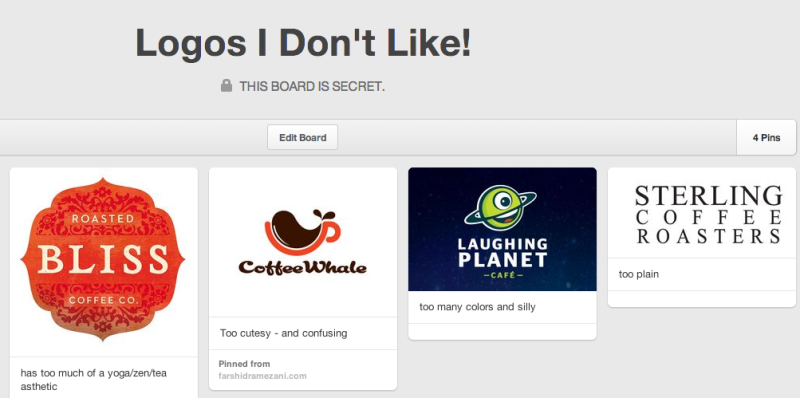
Action Item #3: Create secret Pinterest board of logo/branding likes/dislikes. Note any common themes to the branding you like and the branding you dislike? Including:
- Logos – maybe you like streamlined, vintage-y, modern?
- Color – do you like monchromatic, colorful and bright?
- Fonts – cursive-y, vintage, modern, sanserif?
4. Identify a range of styles in your industry
Is there a style that seems to work well in your industry already? Is there a style that really doesn’t? Think about what feelings you want to convey and how that fits what you do. Security, fun, different, trust, etc. For example, consider how different branding in the finance industry is than a spa or a public relations consultant.
Action Item #4: Note what styles work in your industry.
5. Create a mood board
Before we had Pinterest, many of us were out creating mood boards. Just think of your mood board like a collage. Assemble anything – from pictures, icons, colors – whatever has the look or feel you want for your brand.
Action Item #5: Either add to your “Branding I Like” secret Pinterest board you created in step 3 above or create a new one.
6. Pick a color palette
A great resource for color palettes is Design Seeds. Their website is great inspiration for creating your own color palette. Scroll through, search by hex color code, or browse similar colors. They have hundreds of ideas – each a simple, beautiful photo with 5-6 colors pulled from the image.
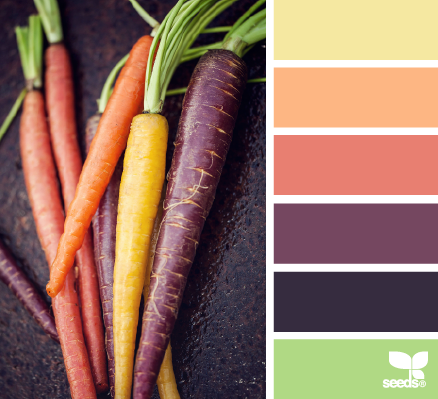
Action Step #6: Add a few Design Seeds palettes to your Pinterest mood board for inspiration or create your own in this style with an image you have that you want to use.
When picking out your own colors, Adobe’s Kuler website is a great resource. Start with one color you want then you can select Color “Rules” – analogous, monochromatic, triad, complementary, compound, shades – to select the rest of your colors. You can also view other users’ themes in the Explore section.
7. Typography – Identify two font that will be part of your style guide
Browse through Google Fonts and Font Squirrel for ideas. The first font should be what most of your content is, example the “copy text” in this blog post is my first font. The second and third fonts can be found in your logo or in graphics used around your site.
Font #1: This will be the body content of your site. It should be very readable. If you have a WordPress theme already selected, and you like the default font used, just use that. In my case it’s Open Sans. To find out what your font is, in Chrome, highlight text and choose Inspect Element tool. In the Styles section on the lower right you’ll see somewhere that looks like: font-family: “Helvetica Neue”, Arial, sans-serif” etc. That’s your font.
Font #2: This is the font in my logo. It’s legible and clean, but still slightly different than my copy text. Josefin Sans – a Google Font.
Font #3: This font is the most “fun”. It’s a little harder to read and has a bit more character so I’ll use it sparingly -in infographic, graphics, and product image titles. I’ll also use my third font sparingly in my Project Proposal client docs. Pacifico – a Google Font.
Action Step #7: Select your main font and secondary fonts. Add them to your Google Doc and test spelling out your brand name in the font or in combination with your tagline.
8. Check out resources for cheap logos & gather your tools
The Internet is full of cheap logo sites. While you can get a “custom” logo created for you on 99Designs or a similar service, I recommend waiting. The amount of time invested (back and forth with your bid and “designer”) to get a logo you don’t really love and isn’t going to last for long is probably not worth it at this point in your branding and website. I recommend one of the following instead:
- Create your own text-based logo with colors, style, fonts you outlined above using Adobe Photoshop (free 30-day trial or purchase a 1-month use) or Pixelmator (free 30-day trial or buy for $29.99).
- Create or purchase with a cheap and less time-intensive site like Squarespace logo, Fiverr, or using design assets from Creative Market.
- Use a free editing software like Picmonkey – add your name, change a color and wait a few months more to invest in a graphic designer!
Action Step #8: Decide on your tools (Photoshop or Pixelmator), and any other resources you’ll use (Fiverr, a template from Creative Market etc.)
9. Create 3 sample logos
You’re finally ready to experiment! Here are some tips on starting:
- Open your software of choice and create a new document (File>New). I usually start with a 800×800 pixel square.
- Select the text tool, click on the background and type your brand name
- Copy and paste your name a few times – trying out several of the fonts you identified in step 7.
- Select the shape tool and create 5-6 blocks near the bottom of your work area – changing the colors to the palette you identified in step 6.
- Change the color of your brand name
- Play with CAPITALIZATION, s p a c i n g, weight (bold, italic etc.)
- Add in any shapes or logo templates, design assets that you found at Creative Market etc.
Action Step #9: Set a timer for 15 minutes and see what you can create. If you’re happy with what you come up with – awesome! Otherwise, come back a few more times, spending 10-15 minutes until you feel it’s good enough to use.
Need more ideas? Check out the following great resources:
- Branding Guides search on Pinterest – there are so many great examples here from simple to detailed
- All About Style Guide – this series from Tuts+ is super comprenesive
- How to Create a Basic Brand Style Guide – good basic tutorial covering fonts, colors, logo from 99Designs
- 10 Tips To Add Some Flair To Your Branding Guide – by Shauna Haider from We Are Branch
- Designing Style Guidelines for Brands and Websites – a classic from Smashing Magazine